Anatomy
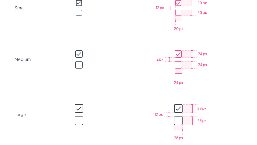
Checkboxes
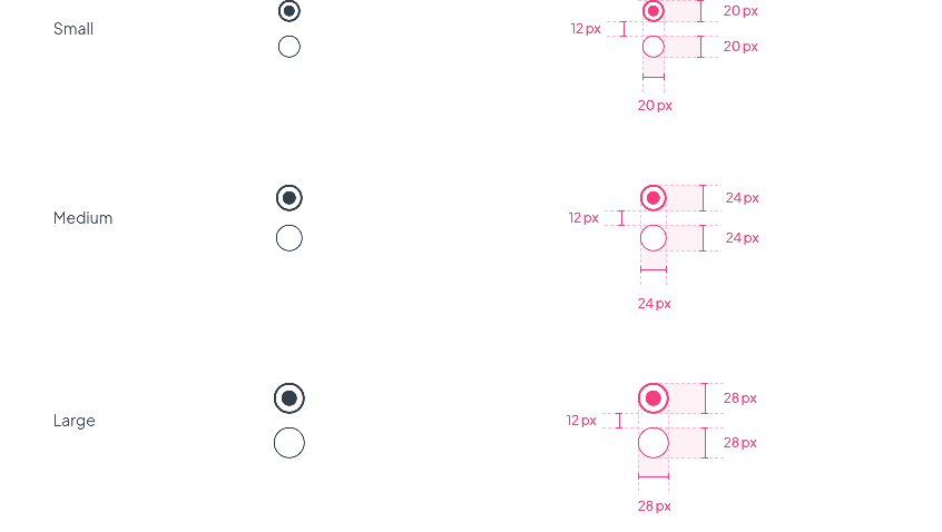
Radio buttons
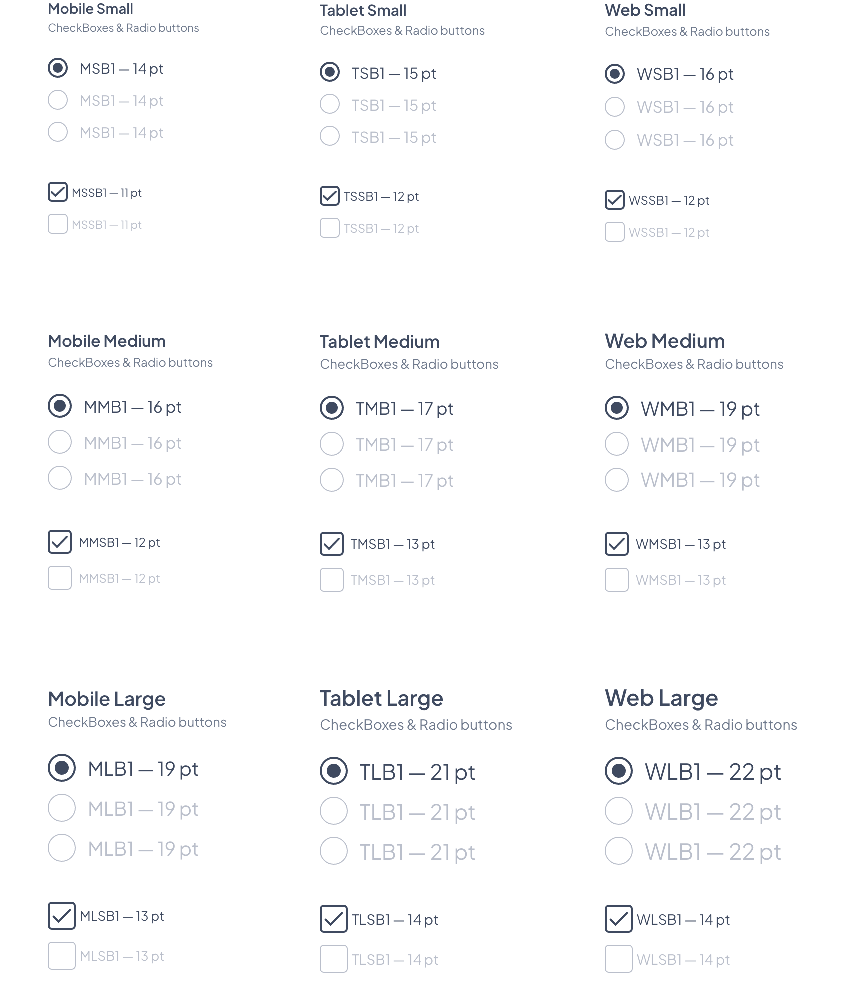
Font Size
The Font size changes depending on the devices and the choice of the component size.
| Component Size | Text Level | Mobile | Tablet | Web | ||||||
|---|---|---|---|---|---|---|---|---|---|---|
| Small | Body 1 | 14 | 15 | 16 | ||||||
| Small Body 1 | 11 | 12 | 12 | |||||||
| Medium | Body 1 | 16 | 17 | 19 | ||||||
| Small Body 1 | 12 | 13 | 13 | |||||||
| Large | Body 1 | 19 | 21 | 22 | ||||||
| Small Body 1 | 13 | 14 | 14 |
Properties
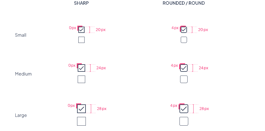
Shape
Checkboxes Border Radius
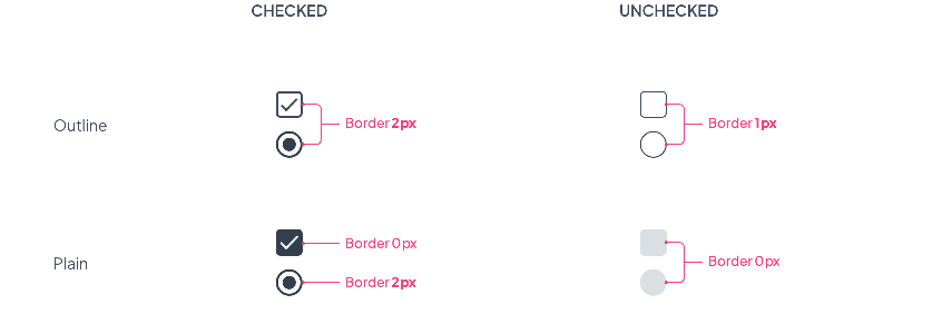
Plain & Outline options
Border size values by state for all sizes (Small / Medium / Large)
Layout
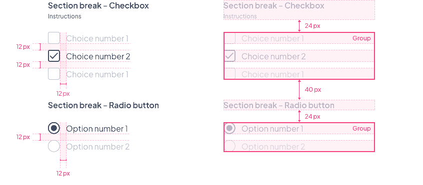
Spacing within a form
Spacings will be the same for all text or component sizes. To see how the components behave within a form, please refer to the Form Layout section
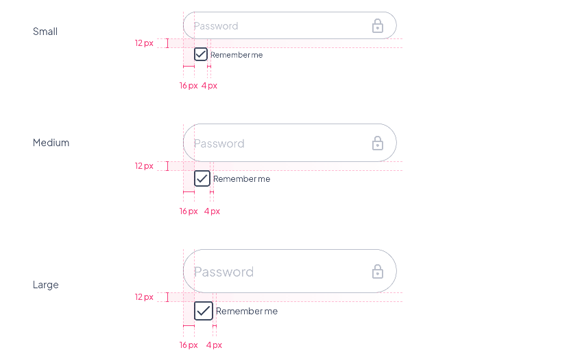
Spacing with a textField
Spacings will be the same for all text or component sizes
Preview
Below a preview where we can find:
- The 3 component sizes Small / Medium / Large
- The corresponding font sizes
- The 2 options Plain and Outline
- The 3 shape options Sharp / Rounded / Round
 Design